Color Psychology For business Branding
BLOGS
Heads up: a few links are affiliate links, and some include special offers you won’t want to miss.
Color is one of the first things people notice about a brand, often before they read a word or understand what the business does.
Within seconds, color shapes how your brand feels. It can make people trust you, feel excited, calm, hungry, curious, or even cautious. That is why color choice is not just a design decision. It is a business decision.
This guide explains color psychology in simple terms and shows you how to choose brand colors that fit your business, your audience, and your goals, even if you have zero design experience.

What Is Color Psychology?
Color psychology is the study of how colors influence human emotions, perceptions, and behavior. Long before we consciously think about a logo or a slogan, our brains are already reacting to color. This happens almost instantly and often without us realizing it.
These reactions are shaped by three main factors:
Biology
Some color responses are hard-wired. Bright reds can raise heart rate and grab attention because, in nature, red often signals danger, blood, or urgency. Cool blues and greens tend to calm us because they are commonly associated with sky, water, and safe environments.
Culture
Color meanings can vary depending on where and how people grew up. White may represent purity and simplicity in some cultures, while in others it is linked to mourning. This is why global brands sometimes adjust color usage for different markets.
Similarly, red in Western countries is often associated with excitement, energy, and urgency like sales, fast food, and sports brands. In contrast, in China and many parts of Asia, red symbolizes good luck, prosperity, and celebration, making it a highly positive and auspicious color.
Experience
Personal experiences also shape color perception. A person who grew up around nature may associate green with peace and comfort, while someone else might connect it to finance or growth because of money and charts.
Brands use color psychology to send signals without saying anything out loud. Color becomes a shortcut for meaning.
For example:
Red often feels urgent or energetic. This is why it is frequently used in food brands, sales banners, and call-to-action buttons. It encourages quick decisions and draws the eye immediately.
Blue often feels trustworthy or calm. Banks, technology companies, and healthcare providers rely on blue because it suggests reliability, stability, and professionalism. It reassures people that their data or money is safe.
Green often feels natural or healthy. Wellness brands, eco-friendly businesses, and organic products use green to signal growth, balance, and care for the environment.
These associations are not strict rules. Red does not always mean danger, and blue does not automatically mean trust. They are patterns that tend to work because many people interpret them in similar ways.
When used intentionally, color helps people quickly understand what kind of brand you are, what you stand for, and how they should feel when interacting with your business, often before they read a single word.
Why Color Matters So Much in Branding
Color is not decoration. In branding, it functions as communication. Before a customer reads your name, understands your product, or compares prices, color has already started shaping how they feel about your business.
Here are the key reasons color plays such a powerful role in branding.
First impressions
People form opinions about a brand within seconds, sometimes in less than a second. Color is often the very first cue they process. A bright, playful palette signals something very different from a dark, minimalist one. Even if two businesses offer similar products, color can make one feel modern, friendly, premium, or risky before a single word is read.
For example, a financial app using soft blues and clean whites feels more reassuring than the same app using neon colors. The product may be identical, but the first impression is not.
Brand recognition
Consistent color use makes your brand easier to recognize and remember. Over time, certain colors become strongly associated with specific brands. You can often identify well-known companies from a color alone, even without seeing the logo.
This matters especially for new businesses. When your website, social media, packaging, and marketing all use the same color system, people begin to recognize you faster. Familiarity builds trust, and color consistency accelerates that process.
Emotional connection
Color sets the emotional tone of your brand. It quietly answers the question, “How does this brand want me to feel?”
Warm colors can feel energetic, friendly, or bold. Cooler colors can feel calm, professional, or secure. Soft, muted palettes can feel thoughtful and human, while high-contrast palettes can feel confident and modern.
When customers feel emotionally aligned with a brand, they are more likely to remember it, return to it, and recommend it to others.
Decision influence
Color can influence behavior and purchasing decisions, especially in environments where people move quickly or compare many options.
In retail and food, color can trigger appetite or urgency. In finance and healthcare, it can reduce anxiety and increase trust. In digital products, color guides attention, highlights important actions, and makes interfaces easier to use.
Even small choices, like the color of a button or banner, can affect whether someone clicks, signs up, or completes a purchase.
For a new business, choosing the right colors early is an investment. It reduces future redesign costs, prevents brand confusion, and creates a clear visual identity from the start. When your colors are intentional, your brand speaks clearly and confidently wherever it appears.

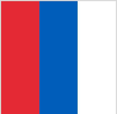
Do you Know Which Brand uses this Colors?
1: Red, White, and Blue
This brand uses a bold mix of red, white, and blue.
It feels energetic, youthful, and familiar worldwide.
It’s often associated with refreshment and fun.
Answer:
This is a classic example of how color alone can trigger brand recognition. Even without a logo or text, your brain already fills in the name.


2: Red and Yellow
These are two of the brightest, most eye-catching colors you can use in branding.
Red and yellow are hard for the human eye to ignore, which is why they feel fast, loud, and attention-grabbing.
They create urgency and excitement, and they are strongly linked to quick decisions and appetite.
Answer:
Red stimulates action and hunger, while yellow adds brightness, friendliness, and high visibility. Together, they are designed to stand out from a distance, catch your attention instantly, and prompt action almost subconsciously.


3: Blue and White
This color combination feels calm, trustworthy, and professional.
It’s commonly used in technology, finance, and social platforms where trust, clarity, and long-term use matter.
Answer:
Blue helps people feel safe and at ease, which is critical when users are sharing personal information or spending long periods on a platform. White keeps the interface clean and easy to navigate, reducing friction and visual fatigue.
Fun Fact:
The choice of blue was not only psychological, but also practical. The Founder has red-green color blindness, and blue is one of the colors he sees most clearly. This made blue a natural, comfortable choice for the platform’s early design.
Did You Get Them Right?
if you got most of them right, you’re probably already tuned in to the psychology of color, a skill that will make your brand stand out and stick in people’s minds.
If some stumped you, don’t worry. That’s the point: colors are subtle but incredibly effective signals. Paying attention to them gives you a huge advantage when building your own brand.
Meaning of each color in Branding
Colors carry meaning because people repeatedly see them used in similar ways. Over time, our brains connect certain colors with certain industries, emotions, and expectations. Below is a practical, business focused look at common brand colors, what they communicate, and how well-known brands use them effectively.


Red
Red signals energy, urgency, passion, and action. It is one of the most attention-grabbing colors, which is why it is often used where quick decisions matter.
You will commonly see red in food, entertainment, and promotional branding. Brands like Coca-Cola, KFC, and McDonald’s use red to stimulate appetite and excitement. In retail, red is everywhere during sales because it creates a sense of urgency. Sports and entertainment brands also rely on red to communicate intensity and competitiveness.
Red works best for bold brands, youth focused products, and businesses that want to feel energetic and dynamic. However, overusing red can feel aggressive or stressful, especially in industries where trust and calm are important, such as finance or healthcare.
Side Note
Red does not mean the same thing everywhere. In many Western markets, red is associated with urgency, sales, and action. In Chinese culture, however, red is strongly linked to luck, prosperity, and celebration. This is why red is commonly used during Lunar New Year, weddings, and major brand campaigns in China/Asian Markets.


Orange
Orange blends the energy of red with the warmth and friendliness of yellow. It feels confident, creative, and approachable without being overwhelming.
Many startups and digital platforms use orange to stand out in crowded markets while still feeling welcoming. Brands like Fanta, SoundCloud, and HubSpot rely on orange to communicate innovation, optimism, and modern thinking. In digital products, orange is frequently used for call to action buttons because it naturally draws the eye and encourages interaction without the urgency or pressure that red can create.
Orange works especially well for brands that want to feel:
Fun and energetic
Modern and forward thinking
Friendly and accessible
It is a strong choice for startups, creative tools, education platforms, and consumer tech.
However, orange should be used with intention. Overuse can make a brand feel informal or less credible, especially in industries like finance, healthcare, or luxury. Pairing orange with neutral tones like white, gray, or dark blue helps keep it balanced and professional.
When used correctly, orange signals confidence without arrogance and energy without stress.


Yellow
Yellow represents optimism, friendliness, warmth, and clarity. It is one of the most noticeable colors, which makes it naturally uplifting and attention grabbing.
Brands like IKEA, Snapchat, and National Geographic use yellow to feel accessible, curious, and human. In lifestyle, education, and creative industries, yellow often signals openness and positivity. Because it catches the eye quickly, yellow is frequently used as a Complimentary color to highlight key elements such as icons, labels, or important messages without overwhelming the overall design.
Yellow works best for brands that want to feel:
Cheerful and approachable
Energetic and optimistic
Curious and creative
It is especially effective when paired with darker or neutral colors that help balance its brightness.
However, yellow is rarely used as a dominant color for luxury, finance, or serious professional brands. When overused, it can feel playful, informal, or visually tiring. Subtle use is key.
When used intentionally, yellow brings light, clarity, and friendliness to a brand without saying a word.
Tip: Pair yellow with dark gray, navy, or black to maintain readability and balance.


Green
Green is strongly associated with growth, health, nature, and balance. It feels calming and reassuring, which is why it is often linked to wellbeing, sustainability, and long term stability.
Many wellness and eco focused brands use green to reinforce their connection to health and the natural world. Whole Foods and The Body Shop lean into green to signal organic, ethical, and health-conscious values.
Patagonia uses green alongside earthy tones to emphasize environmental responsibility and sustainability.
In finance, brands like TD Bank use green to communicate growth, security, and steady progress rather than short term excitement.
Green is also popular in productivity and technology tools that want to feel balanced and supportive rather than intense. It suggests steadiness, renewal, and reliability, making users feel comfortable returning again and again.
Green works especially well for eco-friendly businesses, wellness brands, financial services, and platforms that want to feel calming and trustworthy.
The key challenge is shade selection. Muted or outdated greens can make a brand feel generic or uninspired, while overly bright greens can feel artificial. When chosen thoughtfully, green is one of the most versatile and emotionally grounding brand colors available.


Teal
Teal blends the calming qualities of blue with the rejuvenating energy of green. It communicates balance, sophistication, and modernity.
Brands in healthcare, wellness, tech, and creative industries often use teal. Spotify and Tiffany & Co. (their signature blue-green shade) leverage teal to feel fresh, approachable, and trustworthy. Teal works especially well for brands that want to appear innovative yet reliable, and for businesses aiming to stand out while maintaining professionalism.
Teal is ideal for:
Wellness and lifestyle brands
Modern tech companies
Creative and innovative services
The main caution is overuse. Too much teal can feel cold or impersonal if not paired with warmer accents or friendly messaging. Used thoughtfully, it balances freshness and credibility, making your brand feel both inviting and professional.


Blue
Blue communicates trust, stability, calmness, and reliability. It is one of the most widely used brand colors because it feels safe, familiar, and dependable.
Banks and financial institutions like Chase, PayPal, and Visa rely heavily on blue to reassure customers that their money and data are secure.
In technology, companies such as IBM, Microsoft, and LinkedIn use blue to signal professionalism, competence, and long-term reliability.
Healthcare and insurance brands also lean on blue because it reduces anxiety and creates a sense of calm in situations where people may already feel stressed or uncertain.
Blue works especially well for brands that depend on trust, long term relationships, and repeat use. It helps businesses feel established and credible, even at an early stage.
The main downside is that blue is so common it can feel generic or emotionally distant if used without intention. Pairing blue with warmer colors, strong typography, or human centered messaging helps keep the brand approachable rather than cold.


Dark Blue/ indigo
Indigo sits between blue and purple, combining trust and stability with depth and intuition. It feels thoughtful, intelligent, and quietly confident.
Brands that use indigo often want to signal seriousness without being cold, and creativity without being flashy. You’ll see indigo used in education, analytics, fintech, and professional tools where focus and depth matter. It suggests expertise, reflection, and credibility, making it a popular choice for platforms that deal with knowledge, strategy, or long-term thinking.
Indigo works well for brands that want to feel mature, insightful, and refined. It is especially effective when paired with clean layouts or lighter neutrals, allowing its depth to stand out without overwhelming the design.
The risk with indigo is making a brand feel too serious or distant if it is not balanced with warmth or human-centered messaging. When used intentionally, indigo communicates quiet authority and intellectual strength without shouting for attention.


Purple
Purple often symbolizes creativity, imagination, luxury, and wisdom. Historically, it has been associated with royalty, prestige, and premium quality, which makes it a natural choice for brands that want to stand out as distinctive or aspirational.
Beauty and skincare brands, as well as creative and educational platforms, frequently use purple to communicate richness and imagination. For example, Cadbury uses deep purple to feel indulgent and premium, while Twitch leverages vibrant purple to highlight creativity and energy in the gaming and tech world.
Purple works especially well for:
Premium positioning
Artistic or creative brands
Businesses that want to feel distinctive or imaginative
The key caution is intentionality. If purple is used without a clear purpose or alignment with the brand’s message, it can feel artificial, overly whimsical, or disconnected from what the brand actually delivers. Used thoughtfully, purple adds sophistication, creativity, and a sense of uniqueness that few other colors can match.


Pink
Pink is associated with warmth, care, softness, playfulness, and modern femininity. Its meaning has evolved over time, making it a versatile color for many industries.
Traditionally, pink appeared in beauty, fashion, and lifestyle brands. Today, brands like Glossier, Barbie, and Lyft use pink in bold, modern ways to signal confidence, approachability, and cultural relevance. In tech, fintech, and wellness, pink is increasingly used to challenge norms and stand out in crowded markets.
Pink works especially well for brands that want to feel:
Friendly and human
Emotionally aware
Approachable and nurturing
Shade matters: soft pinks communicate gentleness and care, while bold pinks feel energetic, expressive, and contemporary. Used without intention, pink can feel gimmicky or overly niche, so it’s crucial to align the shade and usage with your brand personality and message.
White
White represents simplicity, clarity, cleanliness, and openness. It gives your brand space to breathe and makes other elements stand out, creating a sense of calm and order.
Healthcare brands, technology companies, and minimalist businesses often use white to convey transparency and trust. Apple, for example, leverages white space extensively to make its products feel modern, intuitive, and premium. In web and app design, white backgrounds improve readability and focus attention on key features.
White works best when paired with strong supporting colors. Alone, it can sometimes feel empty or unfinished, but used thoughtfully, it enhances clarity, strengthens design hierarchy, and reinforces a clean, professional brand image.


Grey
Grey represents balance, neutrality, professionalism, and maturity. It’s a stabilizing color that lets other elements stand out while giving your brand a modern, sophisticated foundation.
Grey is widely used in technology, corporate services, and contemporary design systems. Brands like Apple, Google, and LinkedIn incorporate grey tones to create clean, distraction-free interfaces.
In fashion, architecture, and interior design, grey signals restraint, timelessness, and elegance.
Grey works best for brands that want to feel:
Reliable and professional
Timeless and serious
Balanced and understated
It often serves as a foundation color, supporting brighter accents or stronger primary colors. The main caution is overuse: too much grey can feel dull, impersonal, or emotionally flat. Paired thoughtfully with warm tones or clear, human-focused messaging, grey becomes a powerful tool for clarity, focus, and sophisticated brand presence.


Black
Black conveys sophistication, authority, elegance, and power. It’s timeless and instantly associated with luxury, exclusivity, and confidence.
High-end fashion and luxury brands like Chanel, Nike, and Apple use black to communicate refinement and seriousness. In minimalist branding, black provides strong contrast, clarity, and a sense of structure that reinforces the brand’s professionalism.
Black works especially well for premium brands, professional services, and products aiming for a sleek, modern image. The main caution is overuse—too much black can feel intimidating or unapproachable, which may not suit brands that want to feel friendly, warm, or inclusive. Balanced with lighter tones or accent colors, black becomes a powerful tool for elegance and authority.


Brown
Brown represents stability, reliability, warmth, and a connection to nature. It conveys authenticity, craftsmanship, and grounded values.
Brands in food, coffee, furniture, sustainability, and handmade goods often use brown. UPS relies on brown to communicate dependability and trust, while coffee and chocolate brands use it to evoke richness and earthiness. In eco-conscious branding, brown signals natural materials and ethical production.
Brown works best for brands that want to feel:
Traditional and dependable
Honest and human
Rooted and authentic
The main caution is that brown can feel heavy or outdated if overused. Pairing it with clean typography, lighter tones, or complementary accent colors helps keep the brand modern and approachable.


Gold
Gold symbolizes luxury, success, prestige, and exclusivity. It communicates quality and high value without needing words.
High-end fashion, finance, hospitality, and premium lifestyle brands often use gold. Rolex, Louis Vuitton, and Ferrari use gold accents to signal sophistication and timeless elegance. In marketing and packaging, gold highlights key features, limited editions, or special offers to convey importance and desirability.
Gold works best as an accent rather than a primary color. When used subtly, it signals exclusivity and premium quality. Overusing gold, however, can feel excessive or insincere, so balance and restraint are essential to maintain credibility and elegance.

How to Choose the Right Color for Your Brand
Choosing brand colors is not about picking what looks nice on a mood board. It is about making a clear decision that supports how your business is understood. Before looking at color charts or design tools, start with clarity about your brand.
Here are the key questions to guide that process.
1. What does your business do?
Different industries carry different expectations. A law firm, a fitness brand, and a children’s toy company solve very different problems, so their color logic should reflect that.
A law firm often benefits from calm, authoritative colors that signal trust and professionalism. A fitness brand may use energetic or bold colors to communicate movement and motivation. A children’s brand usually relies on bright, playful colors to signal fun and safety.
The goal is not to copy competitors, but to respect the mental shortcuts people already have. When your colors match what people expect from your category, they understand your business faster.
2. Who is your target audience?
Your audience’s age, culture, lifestyle, and values all influence how they interpret color.
Younger audiences tend to respond well to brighter, more expressive palettes. Professional or corporate audiences often prefer muted, balanced colors that feel credible and composed. Cultural context matters too, as certain colors carry different meanings across regions.
Ask yourself who you are speaking to and what they are likely to feel comfortable with. A color that feels exciting to one group may feel untrustworthy or childish to another.
3. How should people feel when they see your brand?
This is one of the most important questions in color branding.
Do you want people to feel safe and reassured, or energized and inspired? Should your brand feel calm and thoughtful, or bold and confident? Color is one of the fastest ways to create that emotional response.
For example, soft blues and greens tend to create calm and trust, while reds and oranges create energy and urgency. There is no right answer, only alignment. The right color is the one that supports the feeling your brand promises.
4. How do competitors use color?
Looking at competitors helps you understand the visual landscape you are entering.
If most brands in your industry use similar colors, it may be because those colors work. Aligning with them can help you feel familiar and credible. On the other hand, choosing a different color can help you stand out, as long as it still makes sense for your audience.
The key is intentionality. Standing out should be a strategic choice, not an accident.
Choosing a Brand Color Palette (Not Just One Color)
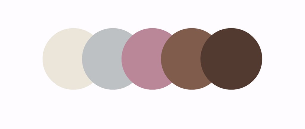
Strong brands rarely rely on a single color. Instead, they use a color system that works together across different platforms, formats, and situations. This is called a brand color palette, and it gives your business consistency without making your visuals feel repetitive or limiting.
A well-built palette makes it easier to design your website, social media posts, packaging, presentations, and marketing materials without reinventing the wheel each time.
A simple and effective brand palette usually includes four parts.
Primary brand color
This is your main identifying color. It is the color people will most strongly associate with your brand over time. You will typically use it in your logo, website headers, key graphics, and major brand elements.
Your primary color should reflect your brand’s core personality and be versatile enough to work in many contexts.
Secondary color
The secondary color supports the primary one. It adds depth and variety without stealing attention. This color is often used in backgrounds, sections of a website, or supporting graphics.
A good secondary color complements the primary color rather than competing with it.
Accent color
Accent colors are used sparingly to draw attention. They highlight important elements such as buttons, links, icons, or calls to action.
Because accent colors are meant to stand out, they are often brighter or more contrasting. Used correctly, they guide the viewer’s eye and improve usability.
Neutral colors
Neutral colors include white, gray, black, and sometimes beige or off-white tones. These colors provide breathing space and balance. They help text remain readable and prevent designs from feeling cluttered or overwhelming.
Neutrals are especially important for long form content, interfaces, and professional materials.
To see how this works in practice, imagine a wellness brand.
The brand might use green as the primary color to signal health and balance. A soft beige could serve as the secondary color to create warmth and calm. A darker shade of green might act as the accent color for buttons or highlights. White would be used throughout to create space and keep everything feeling clean and breathable.
This kind of palette allows the brand to look consistent across its website, social media, packaging, and marketing materials while still feeling flexible and visually interesting.
When your brand colors work as a system, not isolated choices, your business looks more professional, more recognizable, and easier to trust.


Common Color Branding Mistakes New Businesses Make
Choosing brand colors can feel exciting, but it is also where many new businesses go wrong. Most mistakes are not about taste, but about lack of strategy. Understanding these common pitfalls can save time, money, and future rebranding headaches.
Choosing colors purely based on personal preference
It is natural to gravitate toward colors you personally like, but personal taste does not always match business needs. A color that feels right to you may not communicate the right message to your audience or fit your industry.
Brand colors should serve your customers first. The best choices balance personal preference with audience expectations and brand goals.
Using too many colors with no hierarchy
Using many colors without a clear system can make a brand look chaotic and unprofessional. When everything is colorful, nothing stands out.
A strong brand uses a clear hierarchy: one primary color, a few supporting colors, and neutral space. This structure helps guide attention and makes designs easier to understand and recognize.
Copying competitors without strategy
Looking at competitors is useful, but copying their colors outright removes what makes your brand distinct. It can also confuse customers who may associate those colors with another business.
Instead of copying, analyze why certain colors are common in your industry and decide whether to align with them or intentionally differentiate in a meaningful way.
Ignoring contrast and readability
Beautiful colors mean nothing if people cannot read your text or see important elements. Low contrast between text and background hurts accessibility and frustrates users.
Always test your colors in real situations: websites, mobile screens, printed materials. Readability and usability should never be sacrificed for aesthetics.
Changing colors too often and confusing customers
Frequently changing brand colors breaks recognition. When colors shift too often, customers struggle to remember your brand or trust its consistency.
Branding works through repetition. Once you choose a color system, commit to it and use it consistently across all platforms.
Good branding is consistent, intentional, and repeatable. When your color choices follow a clear strategy, your brand feels confident, professional, and easy to recognize over time.

Color Trends vs Timeless Branding
Color trends are everywhere. Each year, social media, design platforms, and fashion cycles promote new “must use” colors. These trends can be exciting and visually appealing, especially for new businesses trying to look modern and relevant.
The challenge is that trends are temporary, while brands are meant to last.
Trendy colors often work best for short term campaigns, seasonal launches, or experimental products. When used as the foundation of a brand, however, they can quickly feel dated. What looks fresh today may look tired or out of place in a few years, forcing costly redesigns and confusing returning customers.
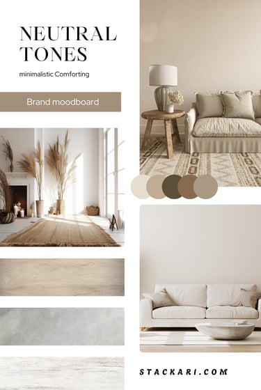
Timeless branding takes a different approach. It focuses on colors that have proven longevity and broad appeal. Neutral tones, classic blues, deep greens, blacks, whites, and muted palettes tend to age well because they are less tied to a specific moment in time.
For businesses planning to grow long term, a balanced strategy works best.
Choose timeless base colors that reflect your core brand values and industry expectations. These colors form the foundation of your identity and should remain consistent over time.
Then, if you want to stay visually current, use trendy colors as accents. Accents can appear in social media posts, marketing campaigns, seasonal graphics, or limited releases without altering your core brand identity.
This approach gives your brand flexibility. You can adapt to trends when it makes sense without losing recognition or starting from scratch. Your brand stays familiar, trustworthy, and modern, all at the same time.
In branding, stability builds trust. Trends can enhance your visuals, but timeless color choices are what carry your brand forward.

Summary
Color speaks before your words do. It is one of the most immediate ways your audience perceives your brand, long before they read your tagline, browse your website, or try your product. In a crowded marketplace, the right colors can make your brand stand out, feel trustworthy, and connect emotionally with customers all without a single sentence being spoken.
For new business owners, choosing the right brand colors is one of the most powerful early decisions you can make. The colors you select will influence first impressions, shape customer perceptions, and even affect behavior like whether someone clicks “buy,” signs up for a newsletter, or shares your content. Done well, color communicates your brand personality instantly and consistently across every touchpoint.
You do not need to be a professional designer to make strong color choices. What matters most is clarity. When you clearly understand your brand’s purpose, values, target audience, and the feelings you want to evoke, choosing colors becomes much easier. Your primary color should reflect your core identity, your secondary and accent colors should support it, and neutral tones should balance and highlight your visuals.
Once those foundations are in place, the right colors usually reveal themselves naturally. Test them in different contexts website, packaging, social media and watch how they perform. Over time, consistent use reinforces recognition and trust. Your colors become a silent ambassador for your brand, conveying personality, professionalism, and promise every time someone interacts with your business.
In short, color is far more than decoration. It is communication, emotion, and memory rolled into one. Choosing wisely gives your brand a head start, builds loyalty, and ensures your business is remembered for all the right reasons.
Subscribe to our newsletter


Enjoy exclusive special deals available only to our subscribers.
FAQ
1. How many colors should my brand use?
Most strong brands stick to 3–5 colors: one primary, a couple of secondary, one accent, and neutral tones. Too many colors can feel messy and make your brand harder to recognize.
2. Can I change my brand colors later?
Yes, but carefully. Frequent changes confuse customers. Minor tweaks are fine, but a full color overhaul should be part of a well-planned rebrand.
3. Do colors actually affect buying decisions?
They do! Color influences emotions and trust, which can impact purchases. Warm colors like red or orange create urgency, while blue and green make people feel calm and confident in your brand.
4. Should I pick colors I like or what my audience likes?
Think of the audience first. Your favorites matter, but brand colors should reflect who you’re speaking to, what your industry expects, and the feeling you want to create.
5. How can I test if my colors work?
Try mockups, social media posts, or landing pages. Ask a small group for feedback or track engagement to see which colors resonate most.
6. Are there colors I should avoid?
Avoid colors that clash with your message or make text hard to read. Neon colors can work for playful brands but might feel unprofessional in finance or healthcare.
7. How do I pick colors that work together?
Use color theory basics: complementary colors (opposites on the wheel), analogous colors (next to each other), or triadic palettes (three evenly spaced). Tools like Adobe Color or Coolors make this easy.
8. Does the shade of a color matter?
Yes! Soft greens feel calming, while neon greens feel energetic or futuristic. Tone and saturation completely change the mood.
9. Can fonts and images affect how colors feel?
Definitely. Color interacts with typography, photos, and graphics. Pairing colors with consistent visuals helps your brand feel cohesive and intentional.
10. How do I make sure my brand colors are accessible?
Check contrast between text and backgrounds and avoid color combinations that are hard for colorblind users to distinguish. Tools like WebAIM contrast checker are lifesavers.
11. Can I use more than one accent color?
Yes, but sparingly. One or two accent colors per campaign or platform is enough to guide attention without overwhelming your main palette.
12. Should I follow color trends?
Trends are great for campaigns or seasonal graphics, but your main brand colors should be timeless. Trends fade, but consistent colors build recognition and trust.
13. Can brand colors affect employees and office culture?
Yes! Colors used internally like in office design, uniforms, or dashboards can influence mood, focus, and team energy. Blues and greens feel calm, while reds and yellows boost energy and motivation.


Business Calculator
View Our handy business calculators! While we make more...


Helpful guide to business branding, and useful calculator to start a business with!
Dorrena

I’ve always heard about passive income, but I never really understood how it worked—until I read this blog.
Brian Moten

★★★★★
★★★★★
Contacts
stackari.contact@gmail.com
